

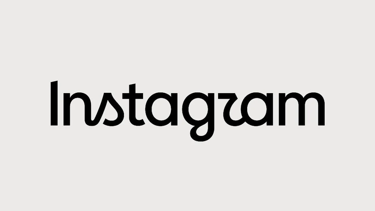
MENLO PARK, CA – August 14, 2026 – In a significant yet subtly executed move, Instagram, the global photography and video-sharing behemoth owned by Meta Platforms, introduced a refreshed wordmark logo on Thursday, August 13, 2026. The update, announced by Instagram head Adam Mosseri across both Instagram and its burgeoning sister platform, Threads, marks the first alteration to the app’s primary textual identifier in a decade. While described by Mosseri as "sharper and more modern," the redesign aims to honor the platform’s familiar script style while subtly redrawing its letterforms, sparking immediate conversation and mixed reactions across its vast user base.
The introduction of the new wordmark comes at a pivotal time for Instagram, as it navigates an increasingly competitive social media landscape and continues to evolve its offerings. This strategic visual refinement underscores a broader industry trend towards iterative design, where established digital brands seek to maintain relevance and aesthetic currency without alienating the deeply entrenched emotional connections users hold with their visual identities.
Main Facts
The Introduction of the Refreshed Wordmark
The announcement of Instagram’s updated wordmark logo on August 13, 2026, was spearheaded by Adam Mosseri, the head of Instagram. Mosseri utilized both the primary Instagram platform and Meta’s newer text-based application, Threads, to disseminate the news, ensuring maximum reach within the company’s ecosystem. His concise yet impactful message characterized the new logo as "sharper and more modern," emphasizing a deliberate effort to refine the brand’s visual presentation. This description immediately set the tone for the update: a move towards contemporary aesthetics while consciously preserving the essence of Instagram’s long-standing identity. The refresh is not a radical departure but rather a careful evolution, reflecting a nuanced understanding of brand equity and user attachment.
The Specifics of the New Design: Redrawn Letterforms
At the heart of the wordmark refresh lies the meticulous redrawing of its letterforms. The core objective was to maintain the distinctive script style that has been synonymous with Instagram since its inception, yet imbue it with a renewed sense of clarity and precision. The designers focused on refining the curves, weights, and spacing of each character, aiming for enhanced legibility across various digital interfaces and screen sizes. This process involved subtle adjustments to stroke thickness, the fluidity of connections between letters, and the overall optical balance of the word "Instagram."
One particular letter, the ‘r’, quickly became a focal point of online commentary. Its newly sculpted form, intended to contribute to the "sharper" and "cleaner" aesthetic, was perceived by some users as resembling a ‘z’, leading to a flurry of humorous observations that the logo now read "Instagzam." This immediate and widespread playful critique highlights the intricate challenges faced by design teams when updating highly recognizable brands. Even the smallest alteration can trigger significant public discussion, demonstrating the profound psychological connection users forge with digital brand identities. Despite the jest, the overall design philosophy appears to be one of subtle refinement, seeking to modernize the familiar script without sacrificing its inherent personality or instant recognizability.
User Reception: Initial Reactions and Online Discourse
The unveiling of the new wordmark was met with a predictably varied reception across social media. While a segment of users and design enthusiasts expressed appreciation for the updated aesthetic, praising its perceived modernity and improved crispness, a significant portion articulated disappointment or indifference. The "Instagzam" joke, in particular, rapidly gained traction, transforming what was intended as a subtle refinement into a subject of lighthearted mockery.
This dichotomy in reception is not uncommon for brand redesigns, especially for platforms with billions of users who have developed a strong emotional attachment to their digital environments. The initial reactions underscore the difficulty of pleasing everyone when altering such a universally recognized symbol. For many, the change was too subtle to be impactful, failing to deliver the excitement often associated with a "new look." For others, the slight alteration of the ‘r’ was enough to disrupt their long-held visual association, even if playfully. The immediate and widespread nature of the feedback, both positive and critical, demonstrates the power of social media as a real-time arbiter of public opinion on corporate design choices.
Chronology
A Decade of Design Stasis for the Wordmark
The most striking aspect of this update, as highlighted by Adam Mosseri, is that the Instagram wordmark had remained largely unchanged for a full decade. In the fast-paced, ever-evolving world of technology and digital design, a ten-year period without significant visual modification for a core brand element is substantial. This prolonged consistency speaks to the enduring strength and timelessness of the original script design, which managed to retain its appeal even as digital aesthetics shifted dramatically around it. However, it also created a latent demand for a refresh, acknowledging that even classic designs can benefit from contemporary refinement to prevent them from appearing dated. The decision to finally update the wordmark signals a strategic acknowledgment that while the core identity is strong, even minor adjustments are necessary to align with current design sensibilities and future digital landscapes.
Instagram’s Visual Evolution: A Timeline
Instagram’s journey through visual design has been marked by distinct phases, each reflecting broader trends in digital aesthetics and the company’s evolving strategic direction.
-
Pre-2016: The Classic Skumorphism Era (2010-2016)
When Instagram launched in 2010, its visual identity was deeply rooted in skeuomorphism – a design philosophy that sought to mimic real-world objects. The iconic app icon featured a brown, retro camera, complete with a rainbow stripe. This design evoked nostalgia for analog photography and was instantly recognizable. The wordmark, while distinct, complemented this aesthetic, embodying a handcrafted, personal feel. This era solidified Instagram’s initial brand as a simple, elegant tool for sharing beautiful, filtered photos, appealing to a sense of authenticity and artistic expression. The skeuomorphic design, while charming, eventually began to feel heavy and outdated as the digital world embraced flatter, more minimalist interfaces. -
2016: The Gradient Revolution and Flat Design Shift
The year 2016 marked a watershed moment in Instagram’s visual history. The company undertook a drastic redesign, ditching the beloved skeuomorphic camera icon for a vibrant, abstract gradient icon. This change was a bold leap into the realm of flat design, characterized by minimalism, bright colors, and simplified graphics. The new icon, a stylized camera outline against a warm, shifting spectrum of pinks, purples, and yellows, aimed to reflect the diversity of content on the platform and its evolution beyond simple photo filters. This overhaul was initially met with significant controversy, as many users mourned the loss of the nostalgic brown camera. However, the design eventually became widely accepted, symbolizing Instagram’s transition into a broader visual storytelling platform. Notably, while the icon underwent a radical transformation, the wordmark itself remained largely untouched, a testament to its foundational strength and the deliberate decision to focus the major redesign effort on the app’s primary visual entry point. -
2026: The Wordmark Refinement and Modernization
The current 2026 update to the wordmark is a more subtle, yet equally strategic, design evolution. Unlike the sweeping changes of 2016, this refresh focuses specifically on the textual brand identifier. It acknowledges that the familiar script style still holds immense brand equity but requires contemporary refinement to enhance its sharpness, legibility, and digital adaptability. This move represents a mature phase in Instagram’s design philosophy – one that prioritizes iterative improvements and nuanced adjustments over radical overhauls, signaling a commitment to sustained modernity while respecting established brand recognition. It suggests a focus on perfecting the details that contribute to a seamless and contemporary user experience.
The Broader Meta Rebranding Context
Instagram’s wordmark update cannot be viewed in isolation; it exists within the broader context of Meta Platforms’ overarching corporate rebranding strategy. Since Facebook’s transformation into Meta in late 2021, the company has been on a mission to redefine its identity, shifting focus towards the metaverse and an integrated ecosystem of interconnected digital experiences. This corporate rebrand involved a new Meta logo, a distinct visual language, and a concerted effort to foster greater coherence across its family of apps, which includes Facebook, WhatsApp, Messenger, Instagram, and Threads.
The Instagram wordmark refresh aligns with Meta’s strategic objective of presenting a unified, forward-looking, and technologically advanced image. It suggests a desire to ensure that all constituent brands within the Meta portfolio reflect a consistent standard of modern design and digital polish. While each app retains its unique identity, there is an observable trend towards cleaner lines, enhanced legibility, and a sophisticated simplicity across Meta’s digital real estate. This update for Instagram’s wordmark, therefore, is not merely an aesthetic choice for one app, but a piece of a larger puzzle aimed at reinforcing Meta’s brand narrative and preparing its core products for future integration and innovation within its burgeoning metaverse vision.
Supporting Data
The Science of Brand Identity and Logos
Logos are far more than mere decorative elements; they are powerful psychological tools that serve as the bedrock of brand identity. From a cognitive perspective, logos function as shorthand, allowing for instantaneous recognition and recall. They are visual anchors that condense complex brand attributes, values, and promises into a single, memorable image. The human brain processes visual information significantly faster than text, making logos exceptionally effective in establishing a brand’s presence in a cluttered marketplace.

- Psychology of Logos: A well-designed logo can evoke specific emotions, build trust, and foster loyalty. It creates a mental shortcut that connects consumers to their past experiences and future expectations of a brand. For Instagram, its script wordmark has long conveyed a sense of creativity, personalization, and artistic flair. Any change, however subtle, can therefore impact these deeply ingrained associations. Designers must carefully consider how alterations might shift perceptions, either reinforcing or inadvertently undermining core brand values.
- The Importance of Legibility and Modernity: Companies update logos primarily to remain relevant and to adapt to evolving technological landscapes. In the digital age, logos must perform optimally across a myriad of screen sizes, resolutions, and display environments. A "sharper" and "cleaner" wordmark, as described by Mosseri, typically implies improved rendering on high-resolution displays, better scalability, and enhanced legibility even at small sizes. Furthermore, design trends shift; what was modern a decade ago might now appear dated. Updates allow brands to signal their currency, appeal to younger demographics, and align with contemporary aesthetic preferences. This is crucial for a platform like Instagram, which thrives on visual appeal and youth engagement.
- Script Fonts in Branding: Instagram’s enduring choice of a script font is noteworthy. Script fonts inherently convey a sense of individuality, elegance, and often, a personal touch. They can evoke feelings of craftsmanship, artistry, and intimacy. For Instagram, a platform built on personal expression and visual storytelling, a script wordmark aligns perfectly with its core proposition. The challenge in redrawing such a font is to maintain its distinctive personality and flow while addressing any legibility issues or outdated stylistic elements. The specific characteristics of the ‘r’ that sparked the "Instagzam" jokes highlight the delicate balance between unique character design and universal readability.
Case Studies: Successful and Controversial Rebrands
The history of corporate branding is replete with examples of both wildly successful and notoriously controversial logo redesigns, offering valuable lessons for companies like Instagram.
- Successful Examples: Companies like Apple have masterfully evolved their logo from a colorful rainbow-striped apple to a sleek, monochromatic version, always retaining the core apple shape. This iterative refinement mirrored their product evolution towards minimalist design and technological sophistication. Google has similarly moved from a playful serif font to a clean, geometric sans-serif, enhancing its digital presence and conveying a sense of accessible intelligence. FedEx famously incorporated a subtle arrow between the ‘E’ and ‘x’ in its logo, a brilliant piece of design that communicates speed and precision without explicit text. These successes often share common traits: clarity of purpose, thoughtful execution, and a deep understanding of the brand’s essence, allowing for evolution without losing core identity.
- Controversial Examples: Conversely, many rebrands have faced significant backlash. Gap‘s attempt to replace its classic blue box logo with a generic Helvetica font in 2010 was met with such outrage that they reverted to the old logo within a week. Tropicana‘s 2009 redesign of its orange juice carton, which removed the iconic orange-with-a-straw image for a minimalist glass of juice, led to a 20% sales drop and a swift return to the original packaging. These instances underscore the immense emotional investment consumers have in established brand visuals. They teach that even minor changes can provoke strong negative reactions if they are perceived as diluting the brand’s identity, lacking character, or being aesthetically inferior to the original. Instagram’s "Instagzam" moment, while humorous, taps into this same vein of user critique, reminding designers that even subtle shifts can be scrutinized intensely.
User Engagement Metrics and Design Impact
While the direct, quantifiable impact of a wordmark change on user engagement metrics (such as daily active users, time spent in app, or content creation rates) is typically subtle and difficult to isolate from other factors, design updates are critical for maintaining a brand’s perceived vitality.
- Subtle Psychological Impact: Even a seemingly minor visual refresh can contribute to a renewed sense of freshness and modernity, subtly influencing user perception of the app as innovative and well-maintained. This can indirectly reinforce loyalty and encourage continued usage. Conversely, an outdated or unrefined visual identity can contribute to a perception of stagnation, potentially impacting user retention over the long term.
- A/B Testing in Design: Modern digital product design heavily relies on A/B testing, where different versions of an element (like a logo or interface component) are shown to distinct user groups to measure their impact on specific metrics. While the wordmark itself is not typically A/B tested in the same way a new feature might be, the decision to update it is usually informed by extensive research into current design trends, user sentiment analysis, and the brand’s strategic objectives. The initial public reaction, therefore, serves as a large-scale, real-time "A/B test" of sorts, providing immediate feedback on the success or failure of the design in meeting public expectation.
- Brand Consistency and Trust: A refreshed wordmark also plays a role in fostering brand consistency across various touchpoints – from the app itself to marketing materials and corporate communications. This consistency builds trust and reinforces the brand’s professional image, which can indirectly contribute to user confidence and engagement.
Design Philosophy Behind Meta’s Brands
Meta Platforms, under its new corporate identity, appears to be cultivating a distinct design philosophy across its family of applications. This philosophy leans heavily towards clean, minimalist, and highly optimized aesthetics, prioritizing functionality and digital adaptability.
- Clarity and Simplicity: Across Facebook, WhatsApp, Messenger, and Threads, there is a clear emphasis on uncluttered interfaces, intuitive navigation, and simplified visual elements. This aims to reduce cognitive load for users and enhance the overall user experience.
- Digital Optimization: Meta’s design choices are inherently optimized for digital screens, favoring scalable vector graphics, clear typography, and color palettes that render well across diverse devices. This ensures a consistent and high-quality visual experience, whether on a smartphone, tablet, or desktop.
- Subtle Differentiation within a Unified Ecosystem: While striving for consistency, Meta also allows each app to retain its unique character. Instagram’s script wordmark, for example, differentiates it from the more geometric wordmarks of Facebook or Threads. This balance allows for individual brand identities to flourish within a cohesive corporate ecosystem, reinforcing the idea of a diverse family of products under a single, overarching brand. The Instagram wordmark update is a manifestation of this philosophy, seeking to refine its unique character while aligning with the broader corporate aesthetic direction.
Official Responses
Adam Mosseri’s Rationale: "Sharper, More Modern, References to the Original"
Adam Mosseri’s statements on Instagram and Threads provided the official rationale behind the wordmark refresh. His description of the new logo as "sharper and more modern" directly addresses the core design objectives. "Sharper" implies improved clarity and precision, particularly in digital rendering, ensuring the logo looks crisp and refined on high-resolution displays and at varying scales. "More modern" speaks to aligning the aesthetic with current design trends, preventing the brand from appearing dated and signaling its continued evolution.
Crucially, Mosseri also emphasized that the new wordmark retains "references to the original" and maintains "the simplicity and craft that’s always made it Instagram." This highlights a strategic balancing act: the desire to modernize without severing ties to the platform’s rich visual heritage. It underscores an understanding of the significant brand equity invested in the original script style. The goal was not reinvention but refinement, a careful sculpting that polishes the existing identity rather than replacing it. This approach aims to reassure long-time users that while the brand is moving forward, its essence remains intact. The "simplicity and craft" point suggests an internal commitment to thoughtful design, where every curve and stroke is deliberately considered to contribute to an overall sense of quality and elegance.
Instagram’s Design Team’s Perspective (Speculative)
While direct, detailed statements from Instagram’s design team are not always publicly disseminated for such updates, one can infer their perspective and process. The brief for such a project would likely have centered on enhancing legibility, improving digital scalability, and subtly updating the aesthetic to reflect contemporary sensibilities, all while preserving the iconic script character.
The process would have involved extensive ideation, sketching, and digital rendering. Iterations would have been critiqued internally, likely undergoing various stress tests to see how the new wordmark performed across different backgrounds, sizes, and digital contexts. The challenge for the designers would have been immense: how to make a noticeable improvement without making it too noticeable or controversial. They would have grappled with the fine line between refreshing and alienating. The specific modifications to letters like the ‘r’ would have been deliberate, aimed at improving flow or balance, even if they inadvertently led to the "Instagzam" jest. Their goal would have been to achieve an optimal blend of heritage and modernity, a testament to their commitment to evolving the brand responsibly.
Addressing the "Instagzam" Critique
The playful "Instagzam" critique, stemming from the specific shape of the redrawn ‘r’, quickly became a prominent part of the online discourse. While Instagram has not issued a formal, specific response to this particular joke, such feedback is invariably monitored by brand teams. In general, companies respond to such lighthearted critiques in various ways:
- Embrace and Engage: Some brands might lean into the humor, perhaps with a witty social media post, to show they are listening and approachable.
- Monitor and Assess: More commonly, they will monitor the spread and sentiment of the critique. If it remains a minor, humorous quip, it might be tolerated as part of the natural online conversation. If it were to escalate into a serious perceived flaw impacting brand image or trust, then a more direct response or even a further minor tweak might be considered, though this is rare for subtle wordmark changes.
- Stand by the Design: Ultimately, the design team likely stands by its decision, believing the chosen ‘r’ form contributes to the overall desired aesthetic and functionality, and that the humorous interpretation is a transient side-effect of any change to a widely recognized symbol. The fact that the wordmark is still clearly recognizable as "Instagram" suggests that the perceived ambiguity is minor and largely rhetorical.
Broader Meta Corporate Communications
The timing and nature of the Instagram wordmark update align with Meta’s broader corporate communications strategy, which has focused on demonstrating innovation, consistency, and a forward-looking vision. Meta aims to project an image of a cohesive technology giant that is constantly refining its products and experiences.
The communication around the Instagram wordmark update was notably concise and direct, delivered personally by Adam Mosseri. This approach suggests a desire for transparency and a direct connection between product leadership and the user base. It also reinforces the idea that even seemingly small design changes are carefully considered and are part of a larger, deliberate strategy to maintain Instagram’s position as a leading visual social platform within the Meta ecosystem. The update is framed not as a reaction to external pressures, but as a proactive step towards sustained relevance and excellence in digital design, reinforcing Meta’s narrative of continuous improvement and adaptation in the digital realm.
Implications
Impact on Brand Perception and User Experience
The refreshed Instagram wordmark, while subtle, carries several implications for brand perception and user experience.
- Subtle vs. Drastic Change: Unlike the drastic icon overhaul of 2016, this wordmark change is a refinement. This subtle approach can lead to different psychological impacts. For many, it will be almost imperceptible, contributing to a subconscious feeling of a continuously updated and polished product without causing disruption. For others, particularly those attuned to design, it reinforces Instagram’s commitment to aesthetic excellence. The minimal nature of the change mitigates the risk of widespread alienation, a common pitfall of more radical rebrands. It signals an evolution rather than a revolution, preserving the comfort of familiarity.
- Reinforcing Core Values: The decision to retain the script style, merely refining its letterforms, strongly reinforces Instagram’s core values of creativity, individuality, and personal expression. A script font inherently feels more human and artistic than a generic sans-serif. By polishing this aspect, Instagram subtly reaffirms its identity as a platform for visual storytelling and community, ensuring that its primary textual identifier resonates with its foundational purpose. The "sharper" and "cleaner" attributes also suggest a modern, high-quality platform that respects visual fidelity.
- Future Design Language: This wordmark update could be a precursor or a signal of a broader evolution in Instagram’s overall design language. It might hint at forthcoming refinements to the app’s user interface, typography, or other visual elements to create a more cohesive, modern, and harmonious aesthetic throughout the platform. Such iterative design updates are common in the tech industry, where visual consistency across an entire application enhances usability and strengthens brand identity.
Competitive Landscape
In the fiercely competitive social media arena, a brand’s visual identity plays a crucial role in its perceived modernity and relevance.
- Staying Relevant: Platforms like TikTok, Snapchat, and an array of newer visual-first applications constantly innovate their user interfaces and branding. By refreshing its wordmark, Instagram signals its commitment to staying current and competitive. It’s a proactive measure to ensure that its visual identity doesn’t fall behind the cutting edge, thus maintaining its appeal to younger demographics who are highly sensitive to aesthetic trends. It projects an image of a dynamic and evolving platform, not one resting on its laurels.
- Meta’s Ecosystem Integration: The update also facilitates better visual integration within Meta’s broader ecosystem. As Threads continues to grow and other Meta products potentially become more interconnected, a harmonized yet distinct visual language across the family of apps becomes increasingly important. The refined Instagram wordmark contributes to this consistency, making it feel part of a unified, modern suite of products while retaining its unique brand personality. This strategic alignment supports Meta’s vision of a seamless, integrated digital experience across its diverse offerings.
The Future of Digital Branding
The Instagram wordmark refresh offers insights into the evolving nature of digital branding.
- The Iterative Nature of Digital Design: Unlike static print logos of the past, digital brands are in a state of continuous evolution. This update exemplifies the iterative design philosophy prevalent in tech, where brands are constantly refined, optimized, and adapted to new technologies and user expectations. It highlights that branding in the digital age is a dynamic process, not a one-time event. Companies understand that to remain relevant, their visual identity must be as agile as their product development.
- User Co-Creation and Feedback Loops: The instant, global feedback, epitomized by the "Instagzam" joke, underscores the unique relationship between digital brands and their communities. Users are no longer passive recipients of design; they are active participants, critics, and often, humorous commentators. This real-time feedback loop allows brands to gauge public sentiment immediately and understand how their visual choices resonate. It emphasizes that while design decisions are made internally, their ultimate success is validated (or challenged) by the collective user experience. The transparency of platforms like Instagram and Threads allows for this unprecedented level of user engagement in the branding process.
Conclusion
Instagram’s refreshed wordmark is a testament to the delicate art of modern brand management. It represents a subtle yet strategic move to update a universally recognized symbol, balancing the imperative for contemporary relevance with the profound importance of brand heritage. By refining its familiar script style, Instagram aims to project an image of a continually evolving, polished, and innovative platform, ready to meet the demands of a new decade in the digital landscape. While sparking immediate conversations and a touch of online humor, the update ultimately underscores Instagram’s commitment to maintaining its aesthetic currency and reinforcing its core identity within Meta’s expansive digital ecosystem. This careful evolution ensures that as Instagram continues its journey, its visual identity remains as dynamic and captivating as the stories its users share.
